LinkedIn Company Page Size Requirements: 2026 Guide
Understanding LinkedIn Company Page Image Requirements Your LinkedIn company page is often the first impression potential customers, partners, and talent have o...
Wilmer KarlssonTarstad
Understanding LinkedIn Company Page Image Requirements
Your LinkedIn company page is often the first impression potential customers, partners, and talent have of your business. Getting image sizing wrong undermines that opportunity before anyone reads a single word about what you do.
Wrong dimensions create a cascade of problems. Cover images get cropped awkwardly, profile pictures appear blurry, and branded graphics lose their impact. These aren't minor aesthetic issues; they signal carelessness to visitors evaluating whether to engage with your company.
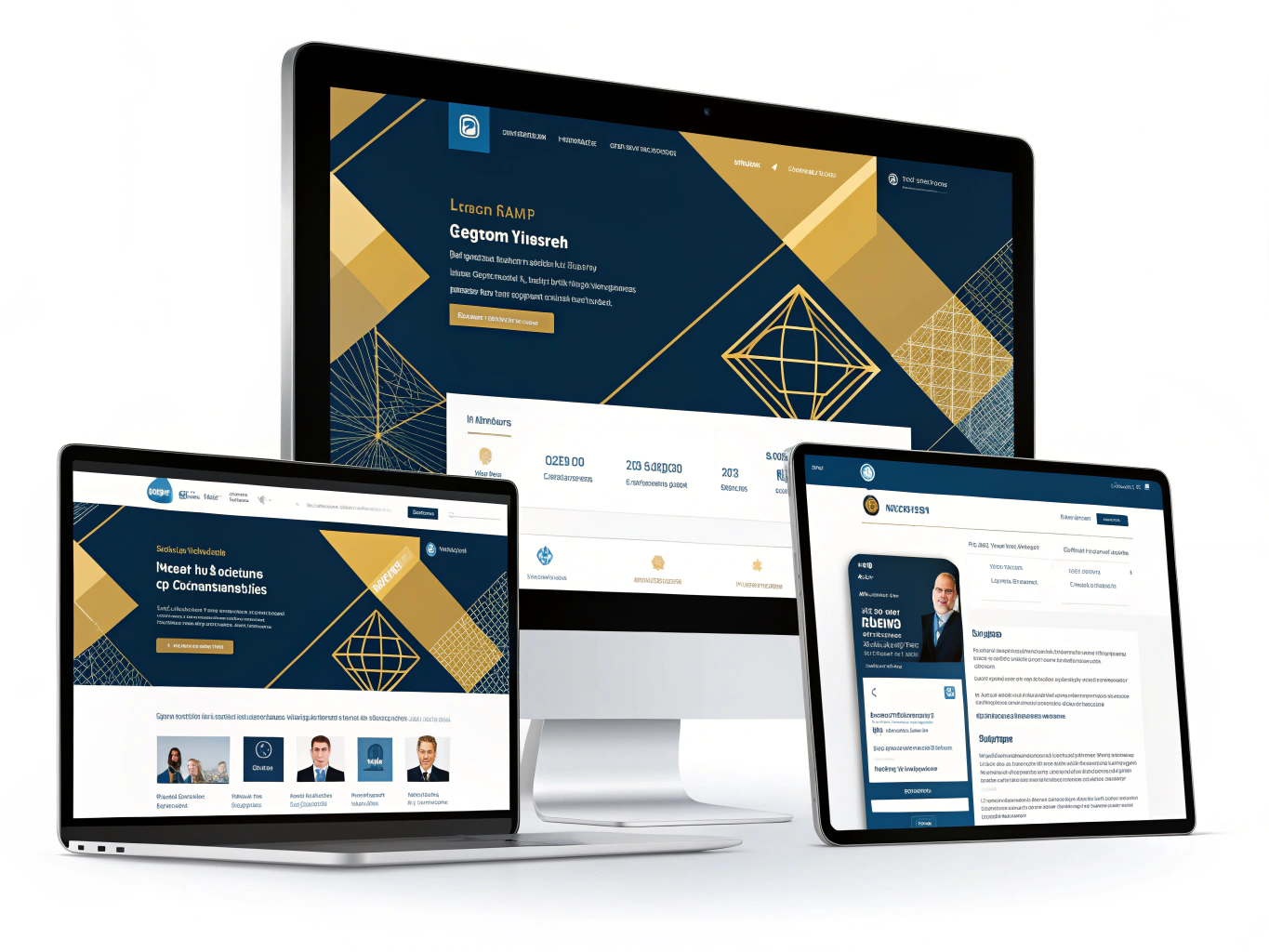
The mobile factor makes this critical. Over 70% of LinkedIn users access the platform primarily through smartphones and tablets, where image cropping becomes even more severe. A cover image that looks perfectly composed on your desktop monitor might be unrecognizable on a mobile screen. Your carefully designed banner could cut off your company logo or key messaging entirely.
Proper sizing directly affects your visibility and engagement metrics. Images that display correctly get more clicks, shares, and profile visits. They reinforce brand consistency across your LinkedIn presence, building trust through professional presentation.
The solution is straightforward: knowing exact specifications before you upload. This guide provides those specifications so you can optimize every image on your company page and maximize the impact of your LinkedIn presence.
Company Page Cover Photo Dimensions and Specifications
LinkedIn's cover photo specifications can seem inconsistent across different resources, but understanding the variations helps you upload images that display correctly across all page sections.
The most widely referenced dimension for your primary company page cover is 1128 x 191 pixels. However, Canva's LinkedIn size guide recommends 1536 x 768 pixels, which provides more flexibility for design and displays better on larger screens. The difference exists because LinkedIn's algorithm scales images differently depending on device type and viewing context.
Beyond the main cover, your Life tab requires a hero image at 1128 x 376 pixels. This taller format accommodates video content and showcases company culture effectively. If you're using the Overview tab, expect smaller cover dimensions of either 360 x 120 pixels or 502 x 282 pixels, depending on which section you're optimizing.
File format requirements are straightforward: use either PNG or JPEG files exclusively. LinkedIn's official image specifications cap file sizes at 3MB maximum for company pages, which is notably smaller than the 8MB limit for personal profiles.
The practical approach: design your primary cover at 1536 x 768 pixels for maximum quality, then scale down appropriately for other sections. This prevents pixelation and ensures your branding looks sharp whether someone views your page on desktop, tablet, or mobile.
Uploading correctly-sized images from the start eliminates the frustration of repositioning cropped content or dealing with blurry visuals. Take the time to verify dimensions before uploading, and your company page will maintain professional polish across every section.
Safe Zones and Device-Specific Cropping Considerations
Your LinkedIn company logo appears in the lower-left corner of your banner image, and this matters more than you might think. On desktop, the overlap is modest; your composition has breathing room. On mobile, however, the story changes significantly. Mobile increases overlap enough to eat into the left side of most compositions, so you must design with the larger mobile occlusion in mind.
This is where the safe zone concept becomes your best friend. Think of it as an invisible boundary where your critical elements need to live. Logos, taglines, and key messaging should occupy the center and right portions of your banner. Avoid placing important text or design elements within 200 pixels of the left edge on mobile devices; this area will likely be covered by your company logo.
The lower-right corner presents another risk zone. Depending on screen size and aspect ratio, LinkedIn may crop your image horizontally or vertically. A call-to-action button positioned there could vanish entirely on certain devices. Instead, keep crucial information centered and away from all four edges, maintaining at least 100-150 pixel margins as a safety buffer.
Before you hit publish, test your banner on both desktop and mobile. Open your company page from your phone; zoom in and out; check how your design adapts. This simple step catches composition problems that desktop preview alone won't reveal. What looks perfectly balanced on your computer might have text clipped or logos obscured on mobile. A quick visual check across devices prevents embarrassing mistakes and ensures your message reaches viewers exactly as intended.
Company Logo Size and Branding Requirements
Your company logo is the visual anchor of your brand identity on LinkedIn. The recommended size for a company page logo is 300 x 300 pixels, and this dimension matters more than you might think.
This logo appears in three critical places: search results when prospects look for your company, your LinkedIn feed when you post updates, and prominently on your company page itself. A crisp, clear logo in these spaces builds immediate brand recognition and signals professionalism to anyone discovering your organization.
When designing or uploading your logo, remember that it will display on both light and dark backgrounds across the platform. Test your logo to ensure it remains readable and visually appealing in both contexts. If your logo includes text or intricate details, verify that text remains legible when scaled down to smaller sizes, particularly in mobile feeds where many professionals browse.
Pay attention to how your logo interacts with your cover photo placement. Your logo typically overlaps the lower portion of your cover image, so avoid placing critical visual elements or text in that zone. This prevents awkward overlapping and maintains a polished appearance across your entire company page header.
Upload a high-resolution PNG or SVG file rather than JPG when possible. This preserves image quality and ensures your logo looks sharp regardless of screen size or device. Taking time to perfect this element pays dividends in how prospects perceive your brand before they even read your company description.
Post Images and Content Sizing for Company Pages
Image dimensions directly impact how your LinkedIn posts perform. Here's what matters: LinkedIn posts with images receive 2x higher engagement compared to text-only updates, making proper sizing essential for business outcomes.
For single or multiple images, use these dimensions:
- Square format: 1080 x 1080 pixels (ideal for product showcases and announcements)
- Portrait format: 1920 x 1080 pixels (captures attention in mobile feeds)
- Landscape format: 1200 x 627 pixels (works well for data visualizations and infographics)
When sharing posts with links, use a 1200 x 627 pixel image with a 1.91:1 ratio. This prevents crucial elements like headlines or logos from being cropped during display. The image must be at least 200 pixels wide; anything smaller appears as a thumbnail, reducing visibility and engagement.
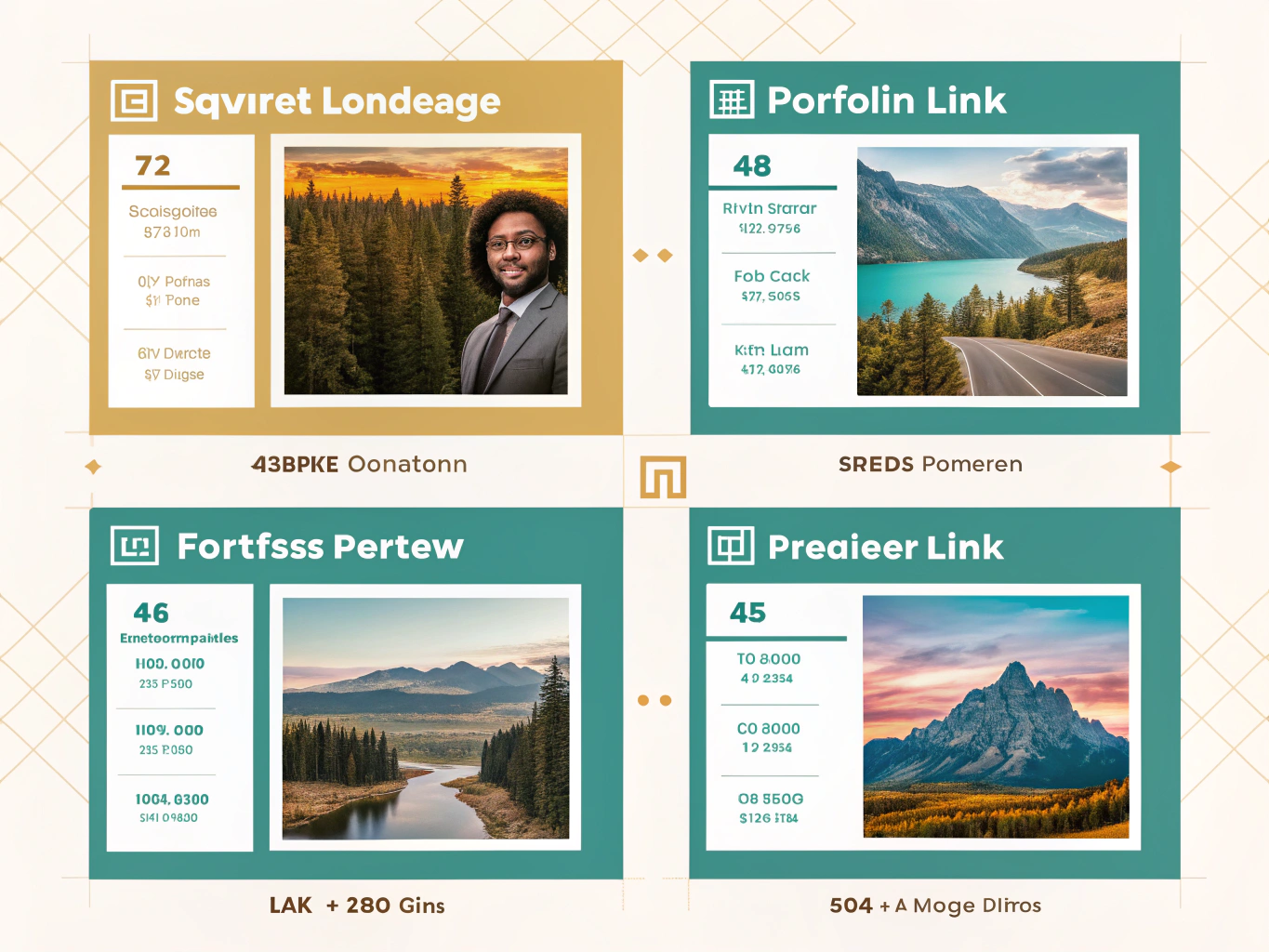
Why does this matter? Almost 60% of LinkedIn traffic comes from mobile users, so uploading images with correct dimensions ensures your content displays properly across all devices. Misaligned images signal poor quality and reduce click-through rates. When your images fit perfectly, nothing gets cut off, your brand looks polished, and your message lands exactly as intended. Spend the extra minute getting dimensions right, and watch your engagement metrics improve.
File Format, Size, and Quality Best Practices
Choosing the right file format makes a tangible difference in how your company page appears to visitors. LinkedIn recommends high-resolution JPEG files instead of PNG for optimal resolution across most images. JPEGs compress more efficiently, which means faster loading times and smaller file sizes without sacrificing visible quality for photographs and complex visuals.
However, PNG files shine when your image contains text, logos, or sharp graphics. They retain clarity in these areas better than JPEGs, though at the cost of larger file sizes. The trade-off depends on your content: use JPEG for banner photos and profile pictures; use PNG when text legibility matters.
File size limits are strict on LinkedIn. Company pages cap at 3MB per image, while personal profiles allow up to 8MB. Exceeding these limits prevents uploads entirely, so check your file size before attempting to publish. Keep in mind that LinkedIn automatically compresses all images during upload to optimize loading speeds, which can sometimes introduce unwanted blurriness.
Blurriness typically stems from three culprits: compression artifacts, insufficient original resolution, or incorrect dimensions. When you upload a low-resolution image and LinkedIn stretches it to fit the required dimensions, pixelation becomes visible. Always start with source images at least 1584 x 396 pixels for banner images.
If you're uploading multiple images and want tighter control over compression, use optimization tools like ImageOptim for Mac or Trimage for Windows. These compress files without noticeable quality loss. Run your images through these tools before uploading to reduce file sizes while maintaining sharpness.
The key is preparing images correctly before upload. Start with high-resolution sources, choose the appropriate format for your content type, and verify dimensions match LinkedIn's specifications. This approach eliminates most quality issues and ensures your company page presents polished, professional visuals that reflect your brand effectively.
Key Takeaways and Implementation Checklist
Remember when your LinkedIn cover photo looked crushed or your logo appeared blurry? Those moments cost you credibility. Getting your image dimensions right eliminates that problem entirely.
Here's your quick-reference checklist for LinkedIn company page sizing:
Critical Dimensions:
- Cover photo: 1128 x 191 pixels (or 1536 x 768 pixels for alternative format)
- Company logo: 300 x 300 pixels
- Life tab images: 1128 x 376 pixels
- Post images: 1080 x 1080 pixels (square) or 1200 x 627 pixels (landscape)
Technical Requirements:
- Use JPEG for photographs; PNG for logos with transparency
- Keep all files under 3MB
- Always center important elements to prevent mobile cropping issues
- Test every image on both desktop and mobile before publishing
Why This Matters:
Companies with optimized LinkedIn banners see a 30% increase in brand visibility, according to Flora AI's visibility research. That's not coincidental. When your images display correctly, your page looks professional, trustworthy, and intentional. Visitors spend more time exploring, and LinkedIn's algorithm promotes content that drives higher engagement, so getting sizing right directly impacts your reach.
The investment is minimal. You're spending minutes on specifications to protect hours of content strategy. Your brand deserves to be seen clearly, not distorted by incorrect dimensions.
Start with this checklist today. Upload one image at a time using these exact specifications, verify it looks sharp on your phone, and watch how much more polished your company page becomes. Small technical details create big professional impressions.