What Does a LinkedIn Post Look Like? Complete Guide 2026
Last Updated: February 6, 2026 TL;DR: Key Takeaways on LinkedIn Post Structure LinkedIn posts come in 7+ formats: text, image, carousel, video, document, poll,...
Wilmer KarlssonTarstad
Last Updated: February 6, 2026
TL;DR: Key Takeaways on LinkedIn Post Structure
- LinkedIn posts come in 7+ formats: text, image, carousel, video, document, poll, and LinkedIn Live
- First 150-210 characters determine whether users click 'see more' or scroll past
- Carousels generate 303% more engagement than single images due to dwell time
- Formatting with white space and symbols creates 3x more engagement than dense text blocks
- Personal profiles outperform company pages by 2.75x on impressions and 5x on engagement
Table of Contents
- What Does a LinkedIn Post Look Like? The Quick Answer
- The Anatomy of a Text-Only LinkedIn Post
- Image Posts, Carousel Posts, and Visual Formats Explained
- The Psychology Behind the 'Hook': Why First Lines Matter Most
- Video Posts: Specs, Formats, and What Works in 2026
- Document Posts, Polls, and LinkedIn Live Explained
- Formatting Techniques That Stop the Scroll: White Space, Symbols, and Emojis
- LinkedIn Post Structure for B2B Lead Generation and Sales
- Common LinkedIn Post Mistakes to Avoid
- Key Takeaways: Creating LinkedIn Posts That Get Noticed
- Conclusion: Your Next Steps for LinkedIn Growth
What Does a LinkedIn Post Look Like? The Quick Answer {#what-does-a-linkedin-post-look-like-the-quick-answ}
A LinkedIn post is a professional content update that appears in your network's feed. It's the core unit of communication on the platform, combining text, images, videos, or documents to share insights, updates, or expertise with your audience.
Posts come in several distinct formats, each with different technical specifications and engagement patterns. Text-only posts work well for quick thoughts and questions. Image posts (single or carousel) drive significantly higher engagement. Video posts command attention and boost algorithmic reach. Document posts showcase whitepapers, reports, or case studies. Native articles let you publish long-form content directly on LinkedIn. Each format serves different purposes depending on your goal.
Here's what matters most: the first 210 characters of your text post appear before the "see more" button. According to MagicPost's formatting research, this is your critical real estate. Everything before that cutoff determines whether someone expands your post or scrolls past. This single constraint shapes how successful LinkedIn writers structure their openings.
Understanding post structure isn't just about aesthetics. For B2B professionals, it directly impacts lead generation, thought leadership positioning, and career visibility. Content creators who grasp how LinkedIn's feed algorithm prioritizes certain formats and how readers scan posts get measurably better results.
The rest of this guide breaks down exactly what each format looks like, the technical specs that matter, and the formatting psychology that drives real engagement.
The Anatomy of a Text-Only LinkedIn Post {#the-anatomy-of-a-text-only-linkedin-post}
Text-only posts remain LinkedIn's most flexible format because they require no design skills and work on every device. Here's what actually happens when you hit "post."
LinkedIn gives you 3,000 characters total, but here's the critical part: only the first 210 characters display before the "see more" cutoff. According to Reply.io's formatting research, those opening 1-3 lines determine whether someone expands your post or scrolls past. This isn't theoretical. Start weak, and your engagement tanks immediately.
The structure that works:
Opening hook (1-2 lines). Make this count. A question, surprising statement, or specific insight. Not "Check out my thoughts on LinkedIn" but "I spent three hours analyzing 500 LinkedIn profiles. Here's what actually converts."
White space is your secret weapon. Dense paragraphs kill engagement. Posts formatted for readability can get up to 3x more engagement compared to dense, unformatted text. Break your content into micro-chunks of 1-2 lines each. Let your eyes rest between ideas.
Visual hierarchy through formatting. LinkedIn doesn't support native bold or italic, but you can create distinction using line breaks, spacing, and strategic symbol placement. A single emoji at the start of a paragraph guides the reader's eye. Unicode bullet points (•, ◆, →) add visual interest without clutter.
Closing with intention. End with a question, call-to-action, or provocative statement. This signals to LinkedIn's algorithm that you want engagement, and it gives readers a reason to comment.
The format works because it's honest. No design tricks, no oversized graphics. Just clear thinking presented clearly. That's why professionals still use it.
Image Posts, Carousel Posts, and Visual Formats Explained {#image-posts-carousel-posts-and-visual-formats-expl}
Visual posts on LinkedIn follow a clear hierarchy of performance, and the format you choose directly impacts how the platform's algorithm treats your content.
Single images should be optimized to 1200x1200 pixels (square) or 1200x627 pixels (landscape). Square images at 1200x1200 pixels are ideal for mobile devices where most LinkedIn browsing occurs, which matters since the majority of LinkedIn users access the platform on phones.
Multi-image posts, which let you upload up to 9 images in a grid, consistently outperform single-image posts because they encourage users to pause and engage. But carousel posts take this further.
Carousel posts, created by uploading a multi-page PDF, generate substantially higher engagement. Carousels achieve 24.42% engagement rates, nearly 4x higher than text posts at 6.67%. The reason is straightforward: carousels generate 303% more engagement than single images because swiping increases dwell time. Each slide a user swipes through signals to LinkedIn's algorithm that your content is valuable enough to hold their attention. That dwell time becomes a powerful ranking signal.
Here's the practical implication: when you're deciding between formats, consider your goal. A single image works for quick announcements. Multiple images suit before-and-after transformations or process breakdowns. Carousels win when you have a narrative to tell, a process to walk through, or data to reveal progressively.
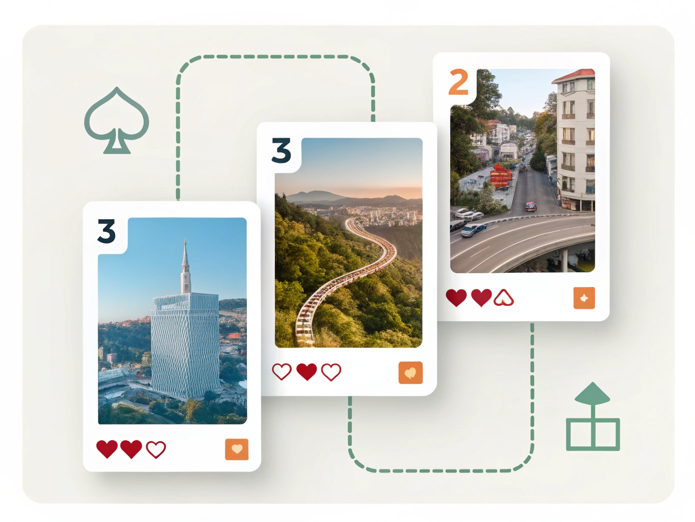
The technical specs matter less than understanding why they work. Your format choice shapes how long someone engages with your post, which shapes whether LinkedIn shows it to more people.
The Psychology Behind the 'Hook': Why First Lines Matter Most {#the-psychology-behind-the-hook-why-first-lines-mat}
On LinkedIn, your first 150-210 characters operate as a psychological gatekeeper. The first 150 characters before 'see more' are extremely important for determining engagement, and this isn't accidental. It's how the platform forces you to make an immediate choice: hook or lose.
Here's why hooks work at a neurological level. Human attention is scarce, and your brain is wired to notice threats, curiosity gaps, and immediate value. A weak opener like "I've been thinking about leadership lately" fails because it promises nothing. Your reader's brain sees no reason to stop scrolling. A strong hook like "90% of managers can't answer this question about their team" creates cognitive tension. Your brain wants to resolve that gap, so you click "see more."
The most effective hooks fall into four categories. Contrarian statements challenge existing beliefs. Statistics create credibility and curiosity simultaneously. Pain point confessions build trust by admitting shared struggles. Questions directly invite participation. Questions serve as a call-and-response to encourage conversations among your audience, which signals engagement to LinkedIn's algorithm.
Critically, effective hooks create tension, curiosity, or promise specific value and don't explain context. Avoid warming up slowly with background information. B2B professionals are scrolling between meetings. You have seconds to prove relevance.
The formatting matters too. Line breaks after your hook create visual breathing room, making the opening stand out. Bold text on key phrases draws the eye. These small choices amplify the psychological impact of your hook.
The result: better engagement rates, more profile visits, and stronger thought leadership positioning in your industry.
Video Posts: Specs, Formats, and What Works in 2026 {#video-posts-specs-formats-and-what-works-in-2026}
Video has become impossible to ignore on LinkedIn. Video views on LinkedIn have grown 36% year-over-year and video creation is growing 2x faster than all other post types, making it the fastest-growing content format on the platform.
Here's what you need to know about technical specs.
Aspect Ratios and Why They Matter
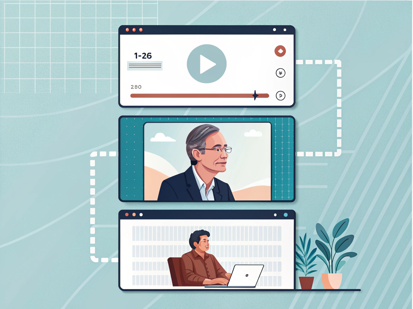
Square (1:1) and vertical (9:16) formats dominate mobile feeds, where most LinkedIn users scroll. Square videos take up more real estate on mobile screens, making them fantastic for stopping the scroll. Landscape (16:9) works for webinars or recorded presentations but performs worse in feed visibility.
Length and File Size
Keep videos under one minute. Viewer retention drops sharply after 60 seconds, and LinkedIn's algorithm favors watch-through rates. Aim for 1080p resolution (1920x1080 pixels) as your standard; it balances quality with reasonable file sizes without unnecessary bloat.
Why Vertical Video Wins
Vertical short-form video is perfect for quick tips or thought leadership content. It's mobile-native, requires less production overhead, and feels more authentic than polished landscape content. The format signals accessibility and directness, which audiences increasingly prefer.
The shift toward video isn't temporary. If your LinkedIn strategy still relies primarily on text posts, you're leaving engagement on the table. Start experimenting with square and vertical formats; the data shows they're worth your time.
Document Posts, Polls, and LinkedIn Live Explained {#document-posts-polls-and-linkedin-live-explained}
Beyond standard text and image posts, LinkedIn offers three formats that solve specific engagement challenges when used strategically.
Document Posts
Upload PDFs, presentations, or reports directly to LinkedIn. Document posts often generate average dwell times similar to carousels and see moderate click-through rates, making them effective for positioning yourself as an expert. Use this format for whitepapers, case studies, research summaries, or industry reports. The key: add a compelling caption that highlights the document's value, not just a link. Technical limit is 10 MB per file. Documents work particularly well in B2B spaces where decision-makers expect substantive content.
Polls
Polls drive participation through questions, not passive consumption. They perform differently than other formats because they interrupt scrolling and demand interaction. Use polls to gather audience insights, test ideas, or spark conversation around timely topics. Keep questions simple with 2-4 answer options. Polls work best when tied to your expertise or industry trends; avoid generic questions that feel like filler.
LinkedIn Live
This is LinkedIn's most interactive format. LinkedIn Live is the platform's most interactive format and consistently drives higher reach and engagement than prerecorded video. However, it has gatekeeping requirements: you need Creator Mode enabled, 150+ followers, and approval from LinkedIn. Live broadcasts receive algorithm priority while streaming, meaning real-time reach is significantly higher. Use Live for Q&A sessions, expert interviews, product launches, or thought leadership discussions where authenticity and real-time interaction add value.
Match the format to your content goal: documents for authority building, polls for audience engagement, and Live for community connection.
Formatting Techniques That Stop the Scroll: White Space, Symbols, and Emojis {#formatting-techniques-that-stop-the-scroll-white-s}
The difference between a post people scroll past and one they stop for often comes down to one thing: breathing room. White space is critical for mobile readability where most LinkedIn browsing occurs, yet most posts cram text together like a dense paragraph. Break your thoughts into chunks. Every one to two lines should introduce a new idea or observation. This creates natural rhythm that feels easy to consume.
Symbols are your silent formatting allies. Instead of relying on bullet points (which can look clunky), use arrows (→), dashes (-), or checkmarks (✓) to guide readers through your message. These Unicode characters add structure without the visual weight of traditional formatting. For example:
✓ Three key lessons from last quarter → Why company culture matters more now
- The metric nobody's tracking yet
Emojis require restraint. Limit yourself to 3-5 emojis or symbols per post to maintain a professional look. Place them strategically at the beginning of key points or at the end of your post to reinforce your message, not scatter them throughout. An emoji should clarify or emphasize, not decorate. A 📈 next to a growth metric makes sense. Random emojis strewn through your text just create visual noise.
Think of formatting as part of your storytelling toolkit. Formatting shapes how your message lands, influencing whether someone engages or scrolls. White space says your ideas are worth their attention. Symbols create hierarchy. Emojis add humanity when used sparingly.
The goal isn't flashiness. It's making your post so easy to scan that people actually read it, absorb it, and feel compelled to respond.
LinkedIn Post Structure for B2B Lead Generation and Sales {#linkedin-post-structure-for-b2b-lead-generation-an}
B2B professionals need to think of LinkedIn post structure as a revenue tool, not just a platform feature. How you organize your content directly impacts whether prospects engage, respond, or scroll past.
Start with your hook in the first line. B2B buyers are decision-makers with limited attention; you have one sentence to prove relevance. Follow with 2-3 short paragraphs that build on a specific insight or problem your audience faces. Break text into scannable chunks using line breaks rather than dense paragraphs.
Tagging deserves strategic attention. Reply.io research shows tagging is an effective way to bring others into conversation and expand your post's reach. Tag collaborators, clients, or industry experts relevant to your point, but avoid over-tagging; three to five tags maximum maintains credibility.
Your call-to-action matters more than most realize. Don't bury it in the middle or skip it entirely. Place a clear CTA at the end: "What's your experience with this?" or "Drop a comment below if this resonates." This drives the engagement that LinkedIn's algorithm prioritizes most. Comments are ranked #1 in importance for LinkedIn's algorithm, making them more valuable than likes or shares for visibility.
Here's a critical insight for B2B professionals: personal profiles generate 2.75x more impressions and 5x more engagement than company pages. If you're posting exclusively from your company account, you're limiting reach significantly. Post from your personal profile, then share to your company page.
Questions naturally trigger responses. Ending with a genuine question beats generic CTAs because it invites conversation rather than demands action. The structure that wins combines credibility, clarity, engagement mechanics, and authentic invitation to dialogue.
Common LinkedIn Post Mistakes to Avoid {#common-linkedin-post-mistakes-to-avoid}
Most professionals sabotage their own reach without realizing it. Here are the mistakes holding your posts back.
Dense text blocks kill engagement immediately. If your post looks like a wall of text, people will scroll right past it no matter how good the message. Break your content into short lines, use white space strategically, and keep paragraphs to 1-2 sentences maximum. Your message needs breathing room.
Your hook lands in the wrong place. The first 150 characters determine whether someone keeps reading or keeps scrolling. Bury your most compelling point in the middle of your post, and you've already lost them. Lead with a question, a surprising stat, or a relatable tension point. Dwell time is crucial for the algorithm, so formatting and hook placement matter significantly.
You're emoji-bombing your posts. Five emojis max. Beyond that, your post looks cluttered and undermines your credibility. Use emojis intentionally to highlight key points, not to decorate every sentence.
You're linking out constantly. Posts with external links are less likely to appear on audience feeds than posts without links. Save external links for comments where interested readers will find them anyway. LinkedIn rewards native content that keeps people on the platform.
Your message targets everyone. Generic, vanilla content written for "professionals" resonates with no one. Write specifically for your ideal audience. Address their exact problem, use their language, reference their world. Specificity drives engagement every time.
These fixes aren't complicated. They just require intentionality.
Key Takeaways: Creating LinkedIn Posts That Get Noticed {#key-takeaways-creating-linkedin-posts-that-get-not}
LinkedIn's algorithm rewards specificity. Here's what actually moves the needle:
The 150-210 character rule matters. This is your hook before the "see more" button. Make it count. Pose a question, share a surprising stat, or create curiosity. Everything after that threshold is invisible until someone clicks, so treat this opening like a headline.
Format determines performance. Carousels generate 303% more engagement than static images because they force dwell time. Text posts spark conversation. Videos build trust. Match your format to your goal: use text for discussion, carousels for teaching, video for credibility.
Formatting transforms engagement. Dense paragraphs get scrolled past. White space, line breaks, and strategic symbols (like bullets or arrows) create 3x more engagement. Your post's visual hierarchy matters as much as your words.
Personal profiles outperform company pages. If you're posting from a business account, you're fighting an uphill battle. Personal profiles generate significantly higher impressions and engagement rates. This isn't changing anytime soon.
Comments are your real metric. Likes feel good, but comments signal to LinkedIn's algorithm that your post sparked genuine conversation. Encourage responses by asking direct questions or inviting perspective.
Know your 7+ formats. Text, image, carousel, video, document, poll, and native articles each have different technical specs and engagement patterns. Using the wrong format for your message wastes reach.
The takeaway: structure matters, format selection matters, and how you present information matters more than you think. Small optimizations compound into measurable results.
Conclusion: Your Next Steps for LinkedIn Growth {#conclusion-your-next-steps-for-linkedin-growth}
You now understand what separates a LinkedIn post that disappears into the feed from one that actually converts. Post structure isn't a minor detail; it's the foundation of your entire LinkedIn strategy. The formatting, white space, and hook placement directly determine whether someone scrolls past or stops to engage.
Here's what to do next: start with text posts. They're the easiest format to test, and strong hooks combined with intentional line breaks deliver measurable results. Once you're comfortable, experiment with carousels to increase dwell time and push your content further into people's feeds.
Don't treat this as a one-time effort. Consistency compounds. The posts you publish this week build momentum for next month's content, especially when you strategically alternate between formats based on what your audience responds to.
Track what works. Use analytics to measure performance across different post types, and let the data guide your decisions. Need help optimizing your posting schedule or creating content that aligns with these structural principles? Tools designed specifically for LinkedIn growth can accelerate your results significantly.
Your LinkedIn presence is built on small, deliberate choices. Master the post structure, stay consistent, and watch your reach and engagement grow.