LinkedIn Banners Size: Complete Guide for Personal & Company Pages 2026
Wilmer KarlssonTarstad
Last Updated: March 4, 2026
Quick Summary
- Personal profile banners: 1584 x 396 pixels (4:1 ratio) with 8MB max file size
- Company page banners: 1128 x 191 pixels for primary cover, 1128 x 376px for Life tab
- Keep critical content within center 60% of banner to avoid mobile cropping
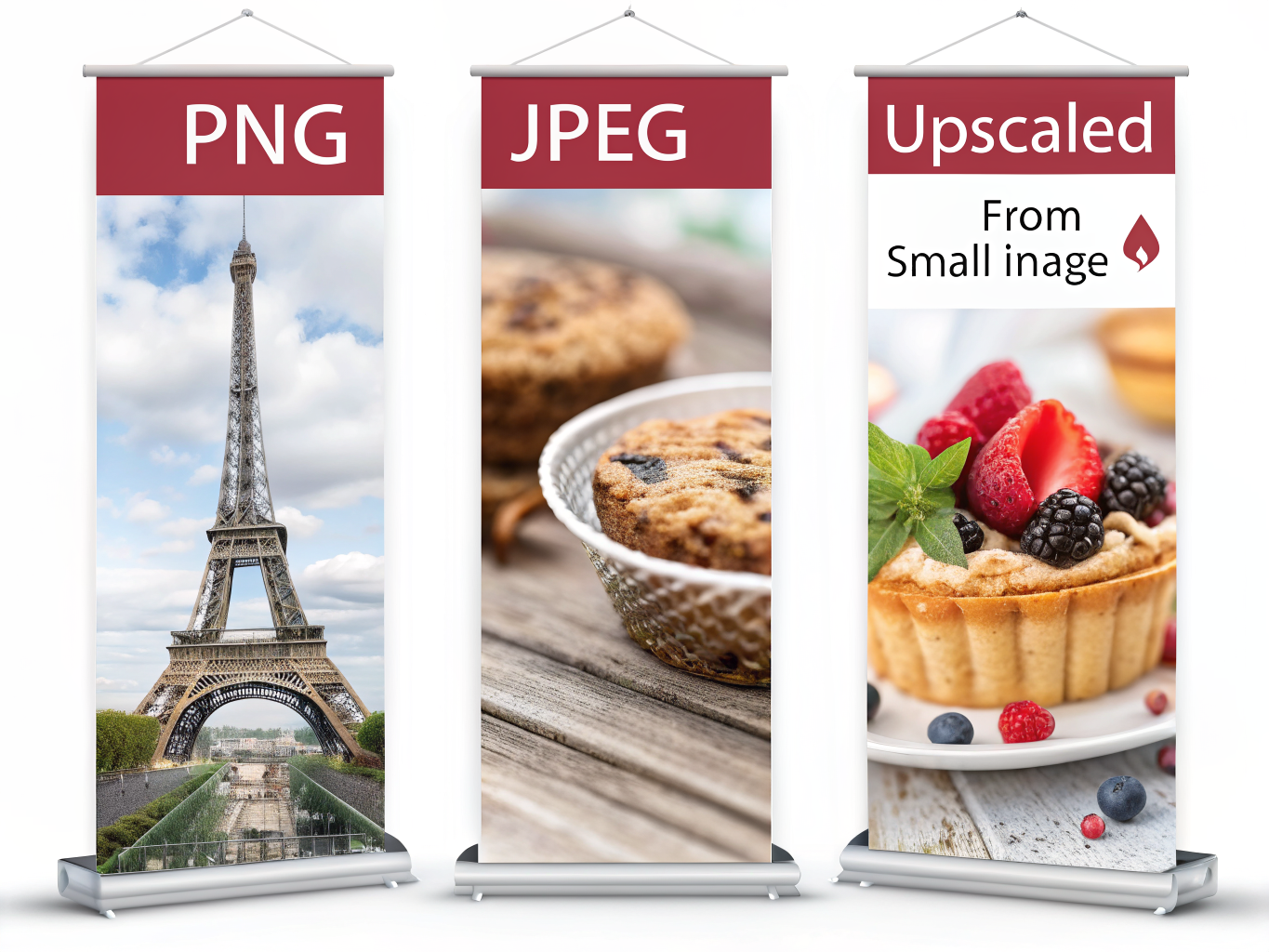
- Use PNG for graphics with text, JPEG for photographic banners to prevent blurriness
- Update banners regularly to reflect current achievements and maintain brand consistency
What Are LinkedIn Banners and Why Size Matters
Your LinkedIn banner is the large background image that displays behind your profile photo. It's the first visual element visitors see when they land on your profile, and it sets the tone for everything that follows. Within 2-3 seconds, that banner communicates whether you're serious about your professional presence or flying blind.
Here's the problem: most people get the dimensions wrong, and it shows immediately. A banner that's too small gets stretched and pixelated. One that's too large crops awkwardly on mobile devices. The result? Your carefully chosen image looks blurry, unprofessional, or worse, completely broken across different screens.
This matters more than you'd think. With 930 million users scrolling LinkedIn daily, and 57% of that traffic coming from mobile devices, your banner must display perfectly everywhere. A poorly sized image damages credibility before someone even reads your headline.
The stakes are real. Posts containing images generate 2x higher engagement rates than text-only updates, but only if those images look professional. A blurry banner tells visitors you don't sweat the details. A crisp, well-sized banner tells them you do.
Getting your banner dimensions right isn't complicated, but it requires precision. The good news: once you nail the technical specs and understand safe zones, you'll never second-guess your banner again. Your profile will look intentional, polished, and credible across every device.
LinkedIn Personal Profile Banner Dimensions: Exact Specs
Here's your section:
Let's cut straight to the numbers. Your LinkedIn personal profile banner should be exactly 1584 x 396 pixels with a 4:1 aspect ratio. This is the sweet spot that displays correctly across all devices without distortion or awkward cropping.
If you're working with legacy systems or older guidelines, the absolute minimum is 1192 x 220 pixels, but don't settle for that. The recommended 1584 x 396 dimension gives you the breathing room your design actually needs.
File Format and Size Matter
Save your banner as either JPEG or PNG. JPEG works best for photographic banners with rich colors and gradients; PNG is your friend when you're adding text, logos, or graphics that need crisp edges. Either way, keep your file under 8MB. Most banners compress easily below 2MB without quality loss, so this shouldn't be a constraint.
The Safe Zone Challenge
Here's where most people stumble: your profile photo overlays the bottom-left corner of your banner, covering approximately 568 x 264 pixels on desktop. This means critical content, text, or branding elements need to live in the right two-thirds of your banner or the upper section.
Mobile flips this equation. The profile photo appears larger on smartphones and tablets, creating even more overlap. Center your important visual elements vertically and push them toward the right to stay clear of the photo zone.
Company Page Banner Sizes: Primary Cover, Life Tab & Events
Company pages require a different banner strategy than personal profiles because they're designed to showcase your brand at scale. Each element serves a specific purpose, and getting the dimensions right ensures your visuals display correctly across devices and sections.
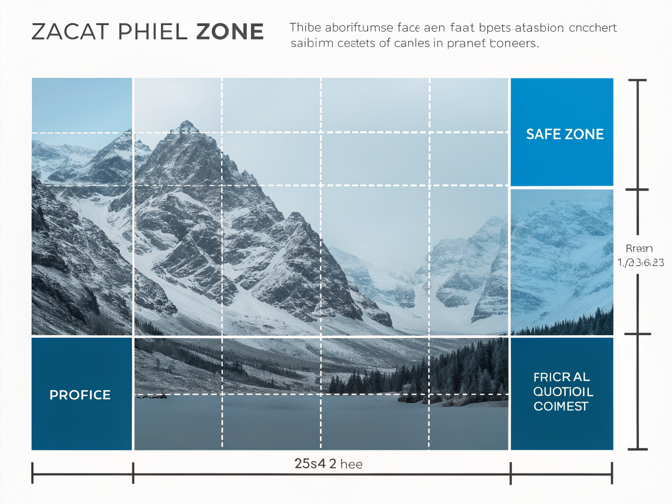
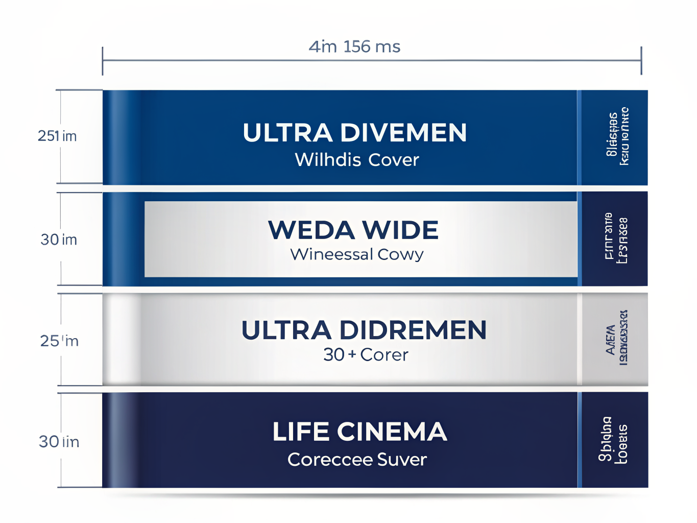
Primary Cover Photo: 1128 x 191 pixels
Company page primary cover photo dimensions are 1128 x 191 pixels. This ultra-wide landscape format creates that distinctive header that visitors see immediately. The extreme 6:1 ratio means your most important branding elements need to sit in the center safe zone, with text and logos positioned to avoid being cropped on mobile.
Life Tab Images: 1128 x 376 pixels
Life tab images use 1128 x 376px dimensions to showcase company culture and employee stories. This 3:1 ratio gives you more vertical real estate than the primary cover, making it ideal for showcasing team moments, office culture, and employee spotlights. The Life tab has become crucial for employer branding, so treat these images as mini-campaigns.
Custom Module Images: 502 x 282 pixels
Custom modules allow targeted messaging within your company page. These smaller rectangles work well for specific announcements, job openings, or campaigns that need focused attention.
Event Banners and Logos
LinkedIn event banners should be 1600(w) x 900(h) pixels in 16:9 ratio with event logo at 300 x 300 pixels. This cinema-style widescreen format works perfectly for webinars and conferences, while the square logo maintains clarity at smaller sizes.
Group Banners: 1536 x 768 pixels
Group pages use 1536 x 768 pixels with a matching 300 x 300 pixel group logo for consistency.
File Specifications
All company page images should be PNG or JPEG format, staying within 3-4MB file size limits. Exceeding this can cause upload failures or slow loading times.
Safe Zones and Device Cropping: Desktop vs Mobile Strategy
Here's the section:
Here's the hard truth: your stunning LinkedIn banner looks completely different on mobile than it does on desktop, and most professionals don't realize this until it's too late. Mobile devices show only the center 60% of your banner width, while desktop displays the full 1584 pixel expanse. 57% of LinkedIn traffic originates from mobile devices where banners are cropped significantly, which means your design strategy needs to prioritize mobile first.
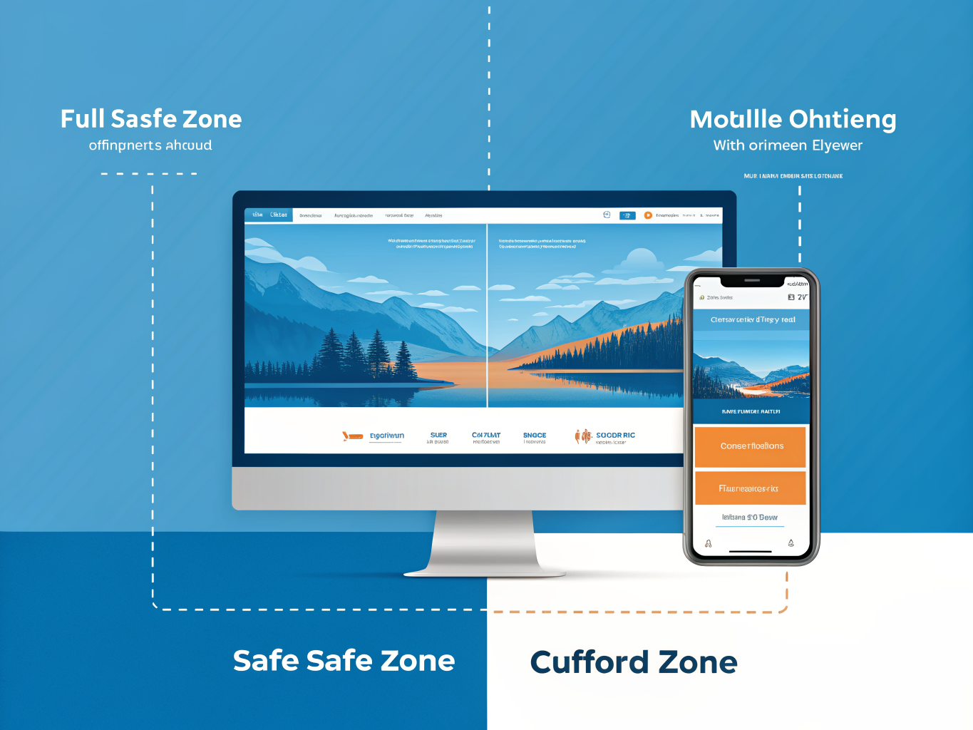
Understanding safe zones isn't just technical jargon; it's the difference between looking polished and looking careless. The critical safe zone for personal profile banners spans approximately 1350 x 220 pixels in the centered area. Any text, logos, or essential visual elements placed outside this zone risk disappearing on mobile screens. Your profile photo, which occupies 568 x 264 pixels on desktop in the bottom-left corner, becomes larger proportionally on mobile, further reducing available space for other content.
The practical rule is simple: keep all important information within the center 60% of your banner. Avoid placing text or logos near the edges or in the lower-right corner; these areas vanish on mobile devices. For company pages, the cropping is even more aggressive, with mobile displays showing only approximately the center 900 pixels.
KEEP essential content within the central 1350 x 220 pixels area to prevent cropping on mobile.
Before you publish, test your banner on both desktop and mobile. Open your profile on your phone; scroll, zoom, and verify that nothing critical disappears. This five-minute step prevents embarrassing redesigns later.
Word count: 358 words
File Format, Resolution & Quality: Avoiding Blurry Banners
Getting your banner file format and resolution right is the difference between looking polished and looking like you uploaded from 2015. Here's what actually works.
File Format: JPEG vs PNG
PNG is recommended for banners containing text or logos because it preserves sharp edges. If your banner includes your company name, tagline, or any graphic elements, use PNG-24 specifically. It prevents that fuzzy text problem that kills credibility.
JPEG works better for photographic banners with landscapes or abstract imagery. It compresses smaller without visible quality loss, which matters for file size limits. Export JPEG at 85-95% quality; anything lower looks compressed and cheap.
Resolution and DPI
The blurriness plaguing most LinkedIn banners comes from uploading images smaller than 1584x396 pixels or using low-resolution source files. Always upload at exactly the recommended dimensions. LinkedIn will stretch undersized images, which destroys clarity instantly.
Blurry banners typically result from uploading images smaller than recommended dimensions or using low-resolution source images. Aim for 300 DPI if possible; 72 DPI is technically acceptable but noticeably softer on screens.
File Size and Compression
Personal profiles allow 8MB maximum; company pages cap at 3-4MB. You rarely need to hit these limits. Optimize PNG compression without sacrificing quality. Use export tools that remove unnecessary metadata.
Design Best Practices: Creating Banners That Convert
Your banner is real estate. Treat it like you would a storefront window, not a billboard for everything you do.
Start with clarity over creativity. Keep banner design clean and simple; too much going on may overwhelm viewers and cause them to click away. This means choosing one focal point, not five. If you're a marketing director, your banner should communicate that instantly, not make visitors decode a cluttered visual puzzle.
Strategic placement matters more than you think. Position main design elements in the middle or right side to ensure profile picture does not cover important information. This is where most people fail. Your carefully designed value proposition gets hidden behind your headshot. Use the left third as breathing room; anchor your message center-right where it stays visible.
Your value proposition belongs front and center. Not your company logo repeated three times. Write 5-10 words maximum that answer: "What's my specialty?" This could be "B2B SaaS Growth Strategist" or "Healthcare Compliance Expert." Make it readable on mobile, where most LinkedIn browsing happens.
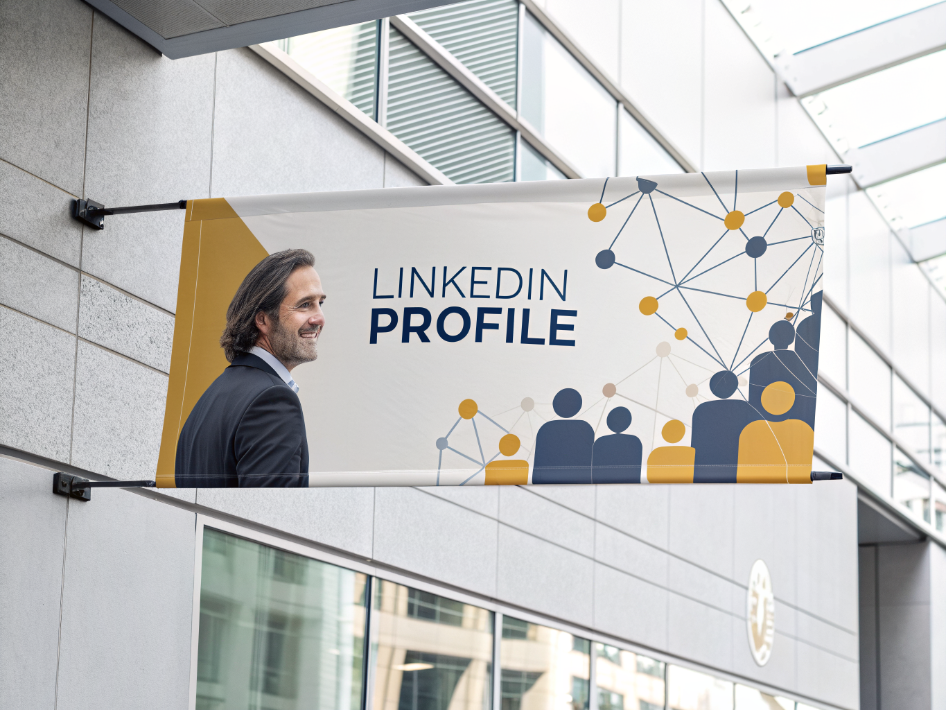
Consistency builds authority. Brand consistency through colors and style creates a cohesive online presence that reinforces professional identity. Your banner colors should match your profile picture frame and post designs. This isn't about perfection; it's about looking intentional.
Finally, update your banner quarterly. New certifications, promotions, or industry recognition deserve visibility. A stale banner suggests stale expertise.
Common Mistakes and How to Fix Them
Here's the reality: most LinkedIn banner mistakes are fixable, and you're probably making at least one without realizing it.
Wrong dimensions causing distortion. A mismatched aspect ratio will cause unexpected cropping even if pixel dimensions are close. This happens when people use outdated specs or guess at dimensions. Always verify you're using 1584x396 pixels for personal profiles and 1200x627 for company pages. These aren't suggestions; they're the exact sizes LinkedIn's algorithm expects.
Uploading undersized images. Avoid uploading images smaller than recommended dimensions which forces LinkedIn to upscale, creating blurriness. Your banner looks pixelated not because of your design skills, but because LinkedIn stretched a 1000x500 image to fit 1584x396. Start with high-resolution source files, always.
Hiding important content in dangerous zones. Your profile photo overlaps the lower-left corner on mobile. Place your call-to-action, logo, or key message in the center-right area where it stays visible across all devices.
Mixing personal and company dimensions. Personal profiles and company pages require different dimensions, requiring separate versions even if design concept is similar. Don't reuse the same file. The aspect ratios are fundamentally different.
Over-compressing before upload. Squeezing your image down to 50KB might seem efficient, but it destroys visual quality. LinkedIn accepts files up to 10MB; use that space.
Skipping the device test. Check your banner on both desktop and mobile before publishing. What looks perfect on your monitor might crop awkwardly on phones. This five-minute step prevents regret.
Key Takeaways: Banner Dimensions You Need to Remember
Here's what you actually need to remember:
Personal Profiles: 1584 x 396 pixels (4:1 ratio), max 8MB, PNG or JPEG format. The recommended LinkedIn banner size for personal profiles is 1584 x 396 pixels.
Company Pages: 1128 x 191 pixels for the primary cover image; 1128 x 376 pixels for Life tab banners. Keep file size under 3MB.
Events: 1600 x 900 pixels (16:9 ratio) with a 300 x 300 pixel event logo.
The Safe Zone Rule: Place all critical content, text, and logos within the center 60% of your banner. Mobile devices crop the edges aggressively, so don't risk important elements getting cut off.
Format Matters: Use PNG for graphics with text or transparency; JPEG for photographs and complex imagery.
Before You Publish: Test your banner on both desktop and mobile views. What looks perfect on desktop often surprises you on mobile.
Positioning Strategy: Keep your profile photo overlap in mind. Position main design elements toward the center or right side to avoid awkward layering.
Keep It Fresh: Update banners quarterly to reflect promotions, certifications, or seasonal achievements. Stale banners signal inactive profiles.
Use design tools with pre-sized LinkedIn templates to eliminate guesswork entirely.
Conclusion: Your LinkedIn Banner Roadmap for 2026
You've now got the exact dimensions, the safe zones, and the technical specs to get your LinkedIn banner right. The hard part is over. What comes next is implementation, and that's where real growth happens.
Here's the truth: a professionally sized banner at 1584 x 396 pixels isn't just a visual detail. It's the foundation of your first impression on 930 million monthly active users. That moment when someone lands on your profile matters. A sharp, correctly dimensioned banner signals competence before a single word gets read.
But here's what separates profiles that stagnate from those that grow: treating your banner as part of a complete strategy, not an isolated fix. Your banner works best when paired with a strong headline, a compelling about section, and consistent engagement. Think of banner optimization as your entry point into broader profile optimization.
Start this week. Pull your current banner, measure it against the specifications we covered, and update it if needed. Then test different designs. Pay attention to which banners drive more profile visits, which ones resonate with your network. Small changes compound.
Your banner is just the beginning. Once it's locked in at the right dimensions, shift focus to your overall LinkedIn presence. Optimize your tagline, refresh your experience section, and build a content strategy that keeps people returning.

Your LinkedIn growth starts now, with the right dimensions.