Your Guide to Perfect LinkedIn Post Image Size
Master the correct LinkedIn post image size for every format. This guide provides all dimensions for profiles, posts, and articles to boost your engagement.
Wilmer KarlssonTarstad
If you want your LinkedIn posts to look sharp and professional, the magic number to remember is 1200 x 627 pixels. This landscape format, with a clean 1.91:1 aspect ratio, is your best bet for ensuring images display perfectly across both desktop and mobile feeds, without any weird cropping.
Your Quick LinkedIn Image Size Reference Guide
Getting your visuals right on LinkedIn isn’t just about looking good—it’s about making an impact. Using the correct dimensions is the difference between a crisp, professional post and a blurry, awkwardly cropped mess that gets ignored.
As of 2025, that standard 1200 x 627 pixels is still the top recommendation for link previews and standard feed posts. Why does it matter so much? Because properly sized visuals can get up to 150% more interaction. On a platform with over a billion members, that's a massive advantage you can't afford to skip. Learn more about these engagement stats.
Think of this section as your go-to cheat sheet. I’ve broken down everything you need for all key placements, from your personal profile picture to your Company Page banner.
This quick visual guide sums up what to keep in mind for your post's dimensions, ratio, and file size.
 As the infographic shows, it’s all about balancing dimensions, aspect ratio, and file size to get the best performance.
LinkedIn Image Size Quick Reference Guide
Here’s a simple table to bookmark. It covers the recommended dimensions and specs for every important image placement on LinkedIn, so you can create perfectly optimized visuals every single time.
| Placement Type | Recommended Dimensions (Pixels) | Aspect Ratio | Max File Size |
|---|---|---|---|
| Personal Profile Picture | 400 x 400 (minimum) | 1:1 (Square) | 8 MB |
| Personal Profile Cover | 1584 x 396 | 4:1 (Landscape) | 8 MB |
| Company Page Logo | 300 x 300 (minimum) | 1:1 (Square) | 4 MB |
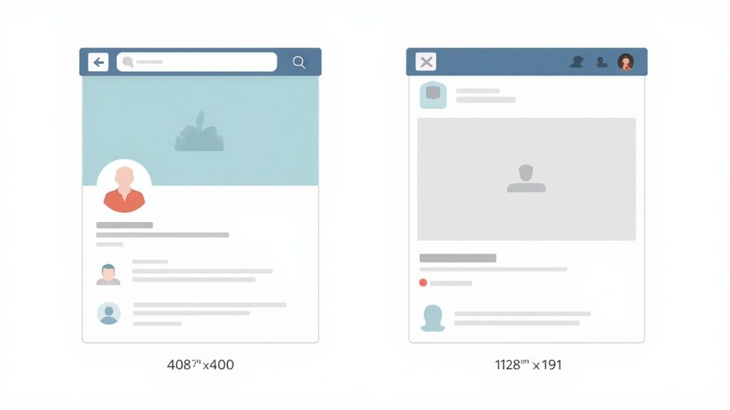
| Company Page Cover | 1128 x 191 | 5.91:1 (Wide Landscape) | 8 MB |
| Feed Post Image (Shared) | 1200 x 627 | 1.91:1 (Landscape) | 5 MB |
| Feed Post Image (Square) | 1200 x 1200 | 1:1 (Square) | 5 MB |
| Link Preview Image | 1200 x 627 | 1.91:1 (Landscape) | 5 MB |
| Article Header/Hero | 1920 x 1080 | 16:9 (Widescreen) | 10 MB |
| Carousel Post (Card) | 1080 x 1080 or 1080 x 1350 | 1:1 or 4:5 | 10 MB per card |
Mastering these simple specs is a small step that makes a huge difference in how your content performs. It helps you stand out, look more professional, and ultimately, get better results.
And if you're looking to really level up your visual strategy, check out our guide on how to repurpose content for LinkedIn.
Your Profile and Company Page: Getting the Basics Right
Think of your LinkedIn profile and Company Page as your digital storefronts. First impressions count, and your images are the very first thing people see. Getting the dimensions right isn't just about looking neat—it's about presenting a professional, credible brand from the jump.
This is where your visual story starts. Mess up these core images, and you risk awkward cropping that makes you look amateurish. For your personal profile especially, these next two images are non-negotiable.
Personal Profile Picture and Banner
Your profile picture is your digital handshake. It needs to be clear, professional, and instantly recognizable.
-
Profile Picture: The magic number is 400 x 400 pixels. LinkedIn will crop it into a circle, but uploading a perfect square ensures no key details get chopped off.
-
Background Banner: You'll want a 1584 x 396 pixel image for your banner. It's a wide 4:1 aspect ratio, so plan your design carefully. Remember, your profile photo will cover up the bottom-left corner on desktop.
Pro Tip: Keep all your important text, logos, or design elements away from the banner's edges. And definitely steer clear of that lower-left corner. This ensures everything stays visible whether someone's viewing on a giant monitor or their phone.
Company Page Logo and Cover
For any business, the Company Page is a critical hub for potential clients, partners, and future hires. Your logo and cover image have to work together to scream "this is who we are" in a split second.
-
Company Logo: Use a 300 x 300 pixel (or larger) square image here. This is the little icon that follows your brand everywhere—in search results, next to your posts, on employee profiles. It's a tiny but mighty piece of your brand identity.
-
Company Cover Image: The recommended size is 1128 x 191 pixels. It's a very short and wide space, almost like a letterbox. It’s the perfect spot for a powerful tagline, a product showcase, or a photo that captures your company culture.
Choosing the Right Image Size for LinkedIn Feed Posts
Sure, the standard 1200 x 627 pixel landscape image is a safe bet, but if you're only using that, you're leaving attention on the table. The LinkedIn feed is more flexible than people realize, and picking the right image orientation can dramatically change how much screen real estate you command—especially on mobile.
The format you choose should be a deliberate decision based on your goal. Are you driving clicks to a blog post? Showing off a detailed infographic? Or just trying to stop the scroll with a bold visual? Each scenario has an ideal image size.
Landscape The Professional Standard
This is the classic LinkedIn look. Sized at 1200 x 627 pixels, it uses a 1.91:1 aspect ratio. It's LinkedIn's default for a reason, especially when you're sharing links, because it perfectly matches the dimensions used for link preview images.
- Best For: Sharing blog posts, news articles, or any content where the main goal is to get someone to click an external link.
- Why It Works: It just looks clean and professional. Users are familiar with it, and it displays predictably across both desktop and mobile without any weird cropping issues.
Square The Mobile Powerhouse
A square image using a 1:1 aspect ratio is your best friend for mobile. Go with 1080 x 1080 pixels or 1200 x 1200 pixels. This format takes up way more vertical space in the mobile feed than a landscape image ever could.
Considering over 60% of LinkedIn users are scrolling on their phones, optimizing for mobile isn't just a nice-to-have anymore. A square image makes your post feel bigger and more immersive on a small screen, which is exactly what you need to stop thumbs from flying by.
This format is perfect for a single, powerful visual like a quote card, a snippet of data, or a big announcement where the graphic is the star of the show.
Vertical Dominating the Feed
If you want to absolutely dominate the feed, portrait is the way to go. The sweet spot is 1080 x 1350 pixels, which comes out to a 4:5 aspect ratio.
This format fills the screen on mobile more than any other, making it almost impossible for someone to scroll past without noticing. It's an incredible choice for infographics, detailed illustrations, or personal branding photos where you need to make a strong visual statement. Just be careful: LinkedIn will crop the top and bottom when viewed on the desktop feed, so always keep your most important information centered.
Making Sure Your Shared Links Look Sharp
You’ve been there. You drop a link to your latest masterpiece, hit post, and… bam. An old, random, or horribly cropped image shows up. It’s one of the most common and frustrating glitches on LinkedIn.
This happens because LinkedIn is guessing. When it can't find specific instructions on which image to use, it just grabs the first one it sees on the page. Not ideal.
To take back control, you need to set an Open Graph (OG) image tag in your website's code. Think of it as a tiny instruction manual that tells platforms like LinkedIn, "Hey, use this specific image for the link preview." It gives you complete command over how your content looks.
Recommended Open Graph Image Size
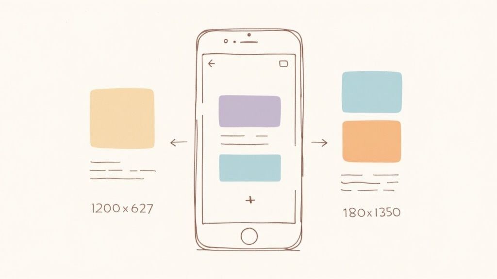
For the best possible results, your OG image needs to be 1200 x 627 pixels. This translates to a 1.91:1 aspect ratio.
Sticking to this standard ensures your image looks crisp and fills the preview space perfectly, with no awkward cropping on desktop or mobile. It’s a small detail that keeps your branding consistent and can make a real difference in click-through rates.
Troubleshooting with the Post Inspector
So, you've updated your OG image, but LinkedIn is stubbornly showing the old one. What gives? The culprit is almost always LinkedIn's cache.
You can force a refresh with LinkedIn’s official Post Inspector tool. It's a lifesaver.
Just copy your URL, paste it into the inspector, and hit the button. This tells LinkedIn to clear its memory and pull the absolute latest version of your page—including your shiny new OG image. It’s the final, crucial check to make sure everything looks polished before you share it with the world.
Sizing Images for LinkedIn Articles and Newsletters
When you're creating long-form content on LinkedIn—think Articles or Newsletters—you're playing a different game. This isn't just a quick feed post; you’re building a professional, magazine-style reading experience. The visuals need to match that elevated feel.Your most important asset here is the hero image. It’s the cover of your piece, the first thing anyone sees. Go with a high-resolution image at 1920 x 1080 pixels. That perfect 16:9 widescreen ratio creates a striking, full-bleed header that grabs a reader’s attention right away.
Best Practices for Article Images
Once you've hooked them with the header, the images inside your article are what keep them scrolling. They break up dense blocks of text, clarify your points, and make the whole piece easier to digest.
- Balance Quality and Speed: Crisp, high-resolution images are a must, but massive files will kill your load times. Always compress your JPGs or PNGs to shrink the file size without sacrificing noticeable quality.
- Write Good Captions: Don't just drop an image in and move on. Add a descriptive caption to give it context. A solid caption can reinforce your core message and make the entire article more impactful.
Remember, every image in an article should have a job. It's there to support your writing, not distract from it. Whether you're visualizing data or adding a bit of emotional punch to a story, make sure each visual serves a clear purpose.
Just like a great hero image, a killer title is non-negotiable for getting those initial clicks. If you're looking for fresh angles, a specialized LinkedIn headline generator can be a great way to brainstorm ideas. In the end, it’s the combination of sharp visuals and even sharper copy that makes long-form content work on LinkedIn.
Putting Your LinkedIn Visuals to Work
Nailing the right LinkedIn image size is just the start. If you want your visuals to actually stop the scroll, build authority, and generate leads, you need to go a little deeper. The small technical and design choices are what separate forgettable content from visuals that truly connect.
First, always start with high-resolution source files. This prevents that blurry, unprofessional look that screams "I don't pay attention to details." When it's time to export, you have two main choices: PNG is your best friend for any graphic with sharp lines, text, or logos. It keeps everything crisp. For photos, JPG is the way to go—it gives you a much smaller file with almost no visible quality loss. No matter which you choose, always compress your images to stay under LinkedIn's 5MB post limit.
Design That Actually Converts
A great visual doesn't just fill space; it communicates your brand's entire vibe and core message in a split second. Here’s how to make sure yours is doing the heavy lifting.
- Weave in Your Brand Elements: Use your brand's colors, fonts, and logo consistently. It’s not just about looking pretty; it’s about building subconscious recognition. The more someone sees your style, the more they trust your name when it pops up in their feed.
- Use Text Overlays with Purpose: Less is more. A powerful headline or a single, shocking statistic will grab attention far better than a block of text. Before you post, gut-check if the text is easy to read on a phone screen—if not, simplify it.
- Stay Visually Consistent: Develop a distinct visual style and stick with it. Whether it's a specific filter, layout, or font pairing, this consistency acts like a uniform for your content. Your audience will start to recognize your posts before they even see your name.
A killer visual strategy is where technical precision meets thoughtful design. It’s about more than just fitting the platform's specs; it’s about creating an image that tells your brand’s story and speaks directly to your ideal client.
Once your image is ready, you need to pair it with copy that converts. To see how your content stacks up and get data-backed suggestions for improvement, a tool like this LinkedIn Post Analyzer can show you what's working and what's not.
Answering Your Top LinkedIn Image Size Questions
Getting your visuals right on LinkedIn can feel tricky. One minute you've uploaded a sharp-looking graphic, the next it's a blurry mess. Here are the quick answers to the most common headaches I see people run into.
Why Does My LinkedIn Image Look Blurry?
Blurry images almost always boil down to two things: a low-resolution file or LinkedIn's own aggressive compression. Always, always start with a high-quality image that's at least 1200 pixels wide for a standard feed post. Think of it as your safety net.
When you're ready to export, save it as a high-quality JPG (an 80% setting is usually a great sweet spot) or a PNG if you have sharp text or logos that need to stay crisp. Finally, watch your file size. Keep it under 5MB, or LinkedIn will step in and squash it down for you, often with disastrous, blurry results.
What's the Best Image Size for Mobile?
Over 60% of LinkedIn users are scrolling on their phones. To grab their attention, you need to own as much of that vertical screen as possible. That's where square (1080x1080 pixels) and vertical (1080x1350 pixels) images win, hands down. They simply fill more space, making your post feel more substantial and harder to just flick past.
How Do I Fix the Wrong Link Preview Image?
Ah, the classic frustrating problem. You share a link to your latest blog post, and LinkedIn pulls some random, ancient image from your site's footer. This is almost always an issue with your website's Open Graph (OG) meta tags.
Dig into your webpage's HTML and make sure there's an og:image tag pointing to the correct 1200x627 pixel image. Once that's fixed on your site, head over to LinkedIn's Post Inspector tool. Paste your link in there, and it will force LinkedIn to clear its old cached version and grab the new, correct preview you just set up.
Ready to turn those perfectly-sized posts into a consistent stream of leads? GetViews.AI uses AI to help you create high-performing content that builds your pipeline without cold outreach. Start converting your expertise into revenue today.