Format LinkedIn Posts for Maximum Impact
Discover how to format LinkedIn posts for more engagement and reach. Learn proven tactics to transform your content and build professional credibility.
Wilmer KarlssonTarstad
To get anywhere on LinkedIn, your posts need to be readable and engaging. It's that simple. That means grabbing attention with a strong hook, breaking up your text into super short paragraphs (think 1-3 sentences), and using things like emojis and bullet points to keep the reader's eyes moving.
This whole structure is designed to make your content easy to scan, especially on a phone, and give people a reason to hit that crucial "...see more" link.
Why Post Formatting Is a Non-Negotiable for Growth
Ever walked past a store with a cluttered, messy window display? You probably kept walking. A dense wall of text on LinkedIn is the digital version of that—it makes people scroll right by. A clean, well-structured post, on the other hand, is like an inviting storefront. It pulls people in.
Proper formatting isn't just about making things look nice; it's a strategic move to capture and hold attention in a feed that never stops moving. Millions of posts are fighting for eyeballs every single day. Without a clear structure, even the most brilliant idea gets completely lost.
Formatting is what makes your message stick.
- It kills reader fatigue: Short paragraphs and lots of white space are your best friends.
- It guides the eye: Emojis and bullet points act like little signposts, telling people where to look next.
- It signals you're a pro: A well-organized post tells your audience you respect their time.
Nailing these fundamentals is the first real step in turning passive scrollers into people who actually care about what you have to say.
The Psychology of the Hook and the Fold
LinkedIn intentionally hides most of your post behind a "...see more" link. That break is called "the fold," and it’s the single most important part of your post. The first couple of sentences—your hook—have one job: earn that click.
A killer hook sparks curiosity, makes a bold claim, or poses a question that’s hard to ignore. If you fumble the hook, the rest of your post might as well be invisible.
Once they click, the body of your post has to deliver on the promise you just made. This is where those short paragraphs and scannable lists become critical. They make the content feel less like a chore and more like a conversation, keeping the reader locked in from start to finish.
This simple flow chart breaks down the powerful three-part structure of a post that actually works.
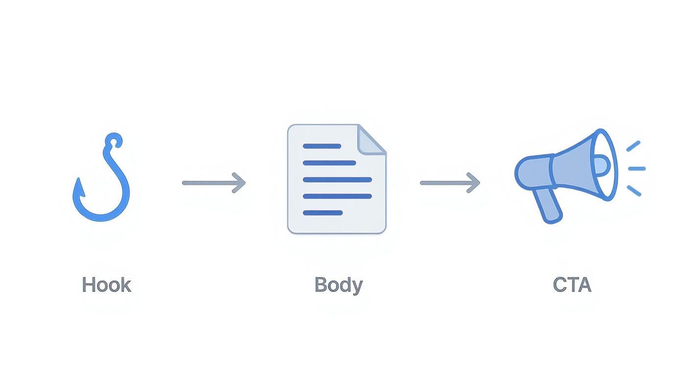
As you can see, it's a clear path: grab their attention, deliver real value, and then tell them what to do next.
To help you internalize this structure, here’s a quick-reference table breaking down the core elements of a LinkedIn post that performs.
Core Elements of a High-Performing LinkedIn Post
| Component | Purpose | Best Practice Example |
|---|---|---|
| The Hook | To stop the scroll and make the reader click "...see more" within the first 2 lines. | "90% of B2B marketers make the same mistake on LinkedIn. Here's what it is..." |
| The Body | To deliver value, tell a story, or share insights in a scannable, easy-to-read format. | Using 1-2 sentence paragraphs, bullet points for lists, and emojis for visual breaks. Keep it clean and full of white space. |
| The CTA | To guide the reader toward a specific next step, sparking conversation or action. | "What's the one thing holding your content back? Drop a comment below." or "Want the full checklist? DM me 'CHECKLIST'." |
| Visuals | To increase visibility and engagement by breaking up the monotony of the text-only feed. | Including a relevant image, a short video clip (under 90 seconds), a document/PDF carousel, or even a simple poll. |
| Hashtags | To improve discoverability and categorize your content for the algorithm and users. | Adding 3-5 relevant, niche hashtags at the end of the post. Avoid overly broad tags like #business or #marketing. |
| Tagging | To notify relevant individuals or companies, boosting reach and encouraging engagement. | Tagging people mentioned in the post or companies you're discussing. Use it sparingly to avoid looking spammy. E.g., "Great insights from @[Person's Name] on this." |
Think of these components as your toolkit. Every great post uses them strategically to build a message that not only gets seen but gets remembered.
Post Length and Its Impact on Engagement
While formatting makes your content easy to consume, its length often dictates its impact. The data points to a clear trend: longer, more thoughtful content tends to spark deeper engagement.
We've found that posts in the 1,300 to 1,600 character range often perform best because they give you enough room for real storytelling and valuable professional insights. But that doesn't mean every post has to be a mini-essay. Shorter posts, around 700 to 1,000 characters, are perfect for quick thoughts, company updates, and just staying visible in the feed.
You can learn more about how post length impacts LinkedIn engagement and see more data-backed tips to fine-tune your strategy.
Your post format is your first impression. A strong hook earns you a click, but clean, scannable formatting earns you the reader's full attention. It’s the difference between being scrolled past and being read.
Choosing the Right Content Format to Boost Engagement
The hook, the copy, the CTA—they all matter. But the container you put your message in is just as important. Picking the right content format on LinkedIn isn't just a creative choice; it's a strategic move that tells the algorithm who should see your post and how they should interact with it.
Each format plays a different game. Your job is to match the message to the format that gives it the best shot at winning.
A deeply personal story, for instance, often hits hardest as a text-only post. The words need to stand on their own, without any visual distractions. But if you're breaking down a complex business framework? A wall of text is a recipe for getting scrolled past. That's where a carousel becomes the obvious choice, letting you slice your idea into digestible, swipeable slides.
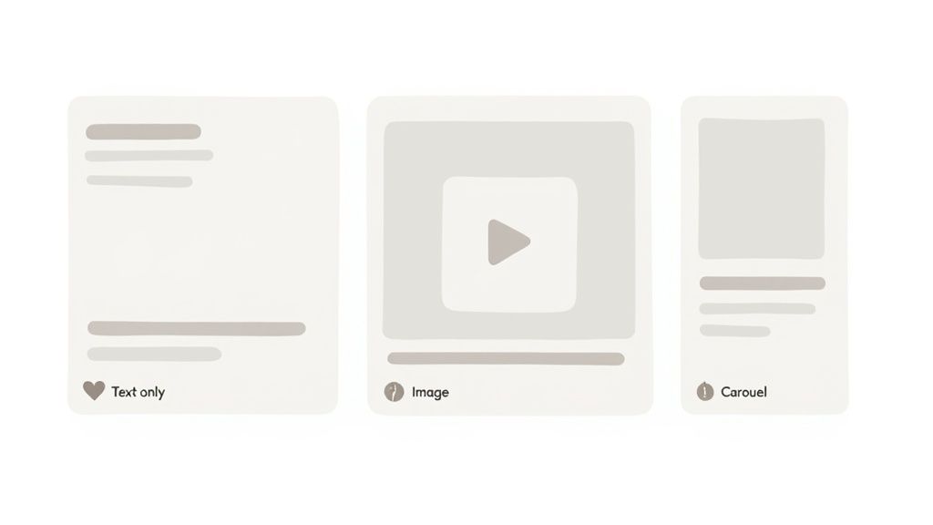
Text-Only Posts The Conversational Starter
Text-only posts are the bedrock of LinkedIn. They feel raw, authentic, and are unbelievably effective for storytelling, sharing a strong opinion, or asking a question that gets people thinking.
Because they’re so simple, they invite conversation. The algorithm loves this. When a text post sparks a genuine discussion in the comments, its reach often explodes. Use this format when your message is the main event and visuals would just get in the way.
Image Posts The Scroll Stopper
Let's be real: a powerful image stops a thumb mid-scroll far better than a block of text. This isn’t a secret. Posts with images consistently pull in higher engagement because our brains are wired to notice visuals first.
This format is perfect for:
- Announcing milestones like a team win or big company news.
- Sharing a killer stat or a key data point from a report.
- Showing behind-the-scenes content that makes your brand feel human.
The only rule? The image has to be high-quality and directly tied to your text. A generic stock photo is a waste of pixels. The visual has to add value and hammer your message home.
Don't just post content; choose the right vessel for it. A carousel can educate, a video can connect, and a simple text post can spark a movement. The format you choose is half the battle.
Video and Carousel Posts The Engagement Magnets
When you need to hold someone's attention for more than a few seconds, video and carousels are your best friends. Video is fantastic for building a personal connection—think short interviews, product demos, or just talking directly to your audience. The movement and sound grab attention in a way static content just can't.
Carousels (which are really just PDFs) are absolute gold for educational content. They’re designed to be interactive, tapping into our curiosity and making us swipe to see what’s next. That "dwell time" is a massive signal to the algorithm that your content is valuable, which almost always leads to more reach.
In fact, the data shows carousel posts generate about 1.8 times more impressions and 2.2 times more clicks than the average post. With an engagement rate hovering around 5.9%, they’ve become a top-performing format for anyone serious about teaching and engaging their audience. You can dig into more stats on why this LinkedIn post format performs so well. This makes them a killer choice when you need to format LinkedIn posts for maximum impact.
LinkedIn Content Format Performance Comparison
To make the choice easier, here's a quick breakdown of how different formats typically perform. Use this to align your content goals with the right post type.
| Post Format | Best For | Average Engagement Rate | Typical Reach |
|---|---|---|---|
| Carousel | Educational content, step-by-step guides, storytelling | 4-6% | High (rewards dwell time) |
| Image | Announcements, data visualization, grabbing attention | 3-5% | Medium to High (strong initial visibility) |
| Text-Only | Personal stories, opinions, sparking conversation | 2-4% | Varies (can go viral with high comment volume) |
| Video | Brand building, tutorials, personal connection | 2-3% | Medium (strong for building audience connection) |
| Poll | Quick feedback, community engagement, market research | 5-10% (votes) | High initial reach, but lower deep engagement |
| Document | Sharing long-form content like reports or whitepapers | 1-3% | Low to Medium (highly niche but valuable to some) |
As you can see, there's no single "best" format. A poll might get you a ton of quick votes, but a carousel is better for teaching a complex idea and building authority. The key is to think about what you want to achieve with each post and pick the format that serves that specific goal.
Using Visuals and Multimedia to Stop the Scroll
Let's be honest, even the best copy in the world can get lost in the endless scroll. A powerful visual is what makes someone slam on the brakes.
Think of it this way: your words provide the logic, but the visual delivers the gut punch. It’s the emotional hook that interrupts the mindless scrolling and makes someone pay attention. The right image, video, or document isn't just window dressing; it's an amplifier for your entire message.
Optimizing Your Visuals for Every Device
Nothing tanks a great post faster than a blurry, awkwardly cropped image. To truly stop the scroll, your visuals have to be pixel-perfect on every screen, from a giant desktop monitor to a tiny phone.
Make sure you're getting the specs right. I recommend bookmarking this complete guide to LinkedIn post dimensions to keep your content looking sharp and professional. Getting these details right is a small step that makes a huge difference.
We also have a deeper dive into crafting the perfect visuals in our guide on the ideal https://getviews.ai/blog/linkedin-post-image-size.
Here are a few quick tips I've learned for making visuals pop, even if you don't have a design team:
- Use high-contrast colors. You need something that stands out against LinkedIn’s standard blue and white interface.
- Add your logo or brand colors subtly. It's a simple way to build brand recognition over time.
- Put a bold headline on the image itself. This reinforces your main point and grabs attention before they even read the first line of your post.
The goal of a visual isn't just to be seen; it's to make your message felt. Use images and videos to tell a story, simplify a complex idea, or just show the human side of your brand.
The Rise of Video on LinkedIn
While static images are solid performers, video is absolutely crushing it on LinkedIn right now. It's not just a trend; the numbers are telling a clear story.
Video usage on the platform is up a staggering 69% year-over-year. More importantly, the algorithm and users both seem to love it. Videos are seeing a +23% increase in reach and a +20% boost in engagement. The data is clear: people want to watch.
But here's the catch: not just any video will do. The ones that perform best are almost always short—think under 30 seconds—and are designed to be watched without sound.
Most people scroll with their audio off, so adding captions is non-negotiable. It’s crucial for both accessibility and impact. Use video to share quick tips, client wins, or some behind-the-scenes content that builds a real connection. This isn't just about adding media; it's a core part of formatting a LinkedIn post that actually works.
Mastering Hashtags and Tagging for Better Visibility
Think of hashtags and tagging as the secret sauce for getting your content in front of the right people. When you use them strategically, they act like signposts, guiding the LinkedIn algorithm—and your ideal audience—directly to your post.
The goal isn't to blast your post with a dozen random tags. It’s about being deliberate. A few well-chosen hashtags and relevant tags can transform a post from a whisper into a broadcast, ensuring it lands in the feeds of people who actually care.
The Art of the Hashtag Mix
Let's get one thing straight: stuffing your post with broad tags like #business or #marketing is a waste of space. Real visibility comes from a balanced, specific mix.
My rule of thumb? Stick to 3 to 5 highly relevant hashtags. This tells the algorithm exactly what your content is about and who it’s for, preventing your message from getting lost in the noise.
Here’s a simple framework that works every time:
- Broad Industry Tags: Start with one or two high-level tags to place your content in a larger professional conversation. Think
#SaaSor#Fintech. - Niche Topic Tags: Add two or three hyper-specific tags that connect you with a dedicated audience. This is where the magic happens. Tags like
#B2BContentStrategyor#SalesEnablementattract people actively looking for your expertise. - Branded Tags: Finally, include one unique tag for your company or personal brand, like
#GetViewsAI. This makes your content easily searchable and helps build a community around your brand over time.
This blend ensures you hit both a wide audience and the niche community most likely to engage, comment, and convert.
Strategic hashtags aren’t an afterthought. They're a core part of your post's structure. They tell the algorithm exactly where your content fits and who needs to see it.
Tagging with Purpose, Not for Spam
Tagging people or companies is one of the most powerful—and most frequently abused—features on LinkedIn. Done right, it sparks conversation and multiplies your reach. Done wrong, it just looks desperate.
The golden rule here is relevance. Simple as that.
Only tag individuals or companies who are directly part of the story. Did you quote an expert? Tag them. Are you sharing insights from a company's latest report? Tag the company. If you're building on an idea someone else shared, tag them to give credit and invite them into the conversation.
It’s about starting a genuine dialogue, not just chasing cheap views. Master the art of doing this properly by checking out our deep dive on how to tag someone in a LinkedIn post. It’s a small detail that makes a huge difference in how you're perceived.
Alright, theory is great, but let's get our hands dirty. It’s one thing to talk about formatting principles; it’s another to see them in action.
Here are a few ready-to-use templates built for common B2B goals. Think of these less as copy-paste formulas and more as frameworks you can adapt to your own voice, industry, and personality. The goal is to make your posts feel both strategic and authentic.
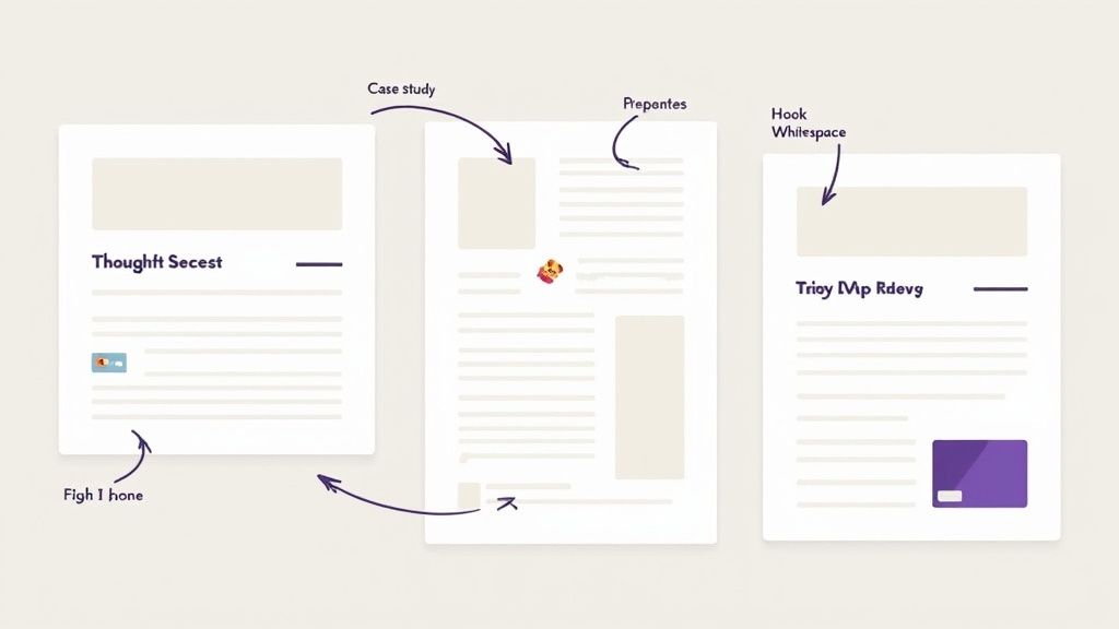
The Thought Leadership Template
This one's perfect for when you want to share a strong opinion, a unique industry insight, or a bit of a "hot take." It’s designed to establish your authority and, more importantly, spark a real conversation. The structure is dead simple: make a bold claim, back it up with a few points, and end with a question that pulls people in.
How it Breaks Down:
- Hook: Kick things off with a provocative statement. Something that makes someone stop scrolling and think, "Wait, what?"
- Context: In just a sentence or two, explain why you believe this. Keep it brief.
- Evidence: Lay out 3 bullet points that support your claim. A little emoji can help guide the eye.
- Conclusion: Restate your main point, but say it a different way.
- CTA: Ask an open-ended question that invites others to share their own experiences or opinions.
Here's What it Looks Like:
Most B2B companies are thinking about content all wrong.
They're obsessed with volume, not value, just hoping something eventually sticks.
Here’s a better way to approach it:
→ Focus on solving one core problem for 90 days straight. → Create content that hits that problem from every conceivable angle. → Ruthlessly repurpose what works and ditch what doesn't.
Stop spraying and praying with your content.
What’s the biggest content mistake you see people making in your industry?
The Case Study Highlight Template
Sharing client wins is a must, but a dry "we're pleased to announce..." post is a guaranteed snoozefest. This template flips the script, turning a success story into a compelling little narrative that shows off results without sounding like a sleazy sales pitch. The secret is focusing on the client's transformation.
A great case study post doesn’t just state the result; it tells the story of the problem you solved. Frame the narrative around your client’s success, not your own.
How it Breaks Down:
- Hook: Start with the client's painful starting point. Make it relatable.
- The Journey: Briefly describe the key challenge they were up against.
- The Solution: Use a numbered list to show the clear, simple steps you took to help.
- The Result: State the quantifiable outcome. Make sure you bold the key metric—it’s the hero of the story.
- CTA: Invite others wrestling with the same problem to chime in.
Here's What it Looks Like:
Our client was getting plenty of clicks, but their conversion rate was completely flat.
They had a ton of traffic but no real way to turn any of it into qualified leads for their sales team.
Here's the simple 3-step process we used to fix their leaky funnel:
1. We analyzed their top 5 landing pages to identify friction points. 2. We rewrote the headline and CTA to focus on a single, undeniable outcome. 3. We A/B tested the new version against the old one for 30 days.
The result? A 47% increase in demo requests from the exact same amount of traffic.
What's one conversion killer you've managed to eliminate from your own funnel?
Measuring Success and Refining Your Formatting
Creating killer posts is only half the battle. The real growth comes from knowing what’s actually working—and what’s falling flat.
Great formatting isn't a "set it and forget it" task. It's an ongoing process of tweaking and refining based on real data. The only way to truly know if your hooks, bullets, and CTAs are hitting the mark is to get comfortable inside your LinkedIn Analytics.
Forget about chasing vanity metrics like a random spike in likes. We're hunting for patterns. Your goal is to stop guessing what your audience wants and start knowing what they respond to.
Key Metrics to Track for Format Effectiveness
Start by digging into the analytics for your individual posts. It’s easy to get overwhelmed, so let’s focus on the numbers that tell you a clear story about your formatting.
- Impressions: This is your reach. Are posts starting with a question getting consistently more eyeballs than those starting with a bold statement? This can be a huge clue that the algorithm—and your audience—is favoring that particular style of hook.
- Click-through Rate (CTR): This is the percentage of people who saw your post and actually clicked "...see more." A high CTR is direct proof that your first couple of lines are doing their job. If your CTR is low, your hook is the first thing you need to fix.
- Engagement Rate: Don’t just look at the raw number of likes and comments. The real metric is (Likes + Comments + Shares) / Impressions. This tells you how compelling your post was relative to how many people saw it. A post with 100 likes and 1,000 impressions is way more successful than one with 200 likes and 20,000 impressions.
Your LinkedIn data tells a story about what your audience craves. A dip in impressions might mean your hook is weak, while a low CTR signals a disconnect between your opening lines and the reader's curiosity. Listen to the data; it’s your best guide for refinement.
Connecting Data to Formatting Decisions
Once you have the numbers, you have to connect them back to your actual posts. This is where you put on your detective hat and start spotting the trends.
Did that carousel with big, bold numbers on each slide get a way higher engagement rate than the one with plain text? That’s your sign to double down on that visual style. Maybe you notice that your short-and-sweet text posts—the ones under 1,000 characters—consistently get more comments than your long, deep-dive articles.
This is how you build your own personalized formatting playbook. It’s not about following generic advice; it’s about discovering what your specific audience wants to see.
To speed things up, a dedicated LinkedIn post analyzer can help you spot these patterns much faster than scrolling through your feed manually.
Simple A/B Testing for Constant Improvement
You don’t need fancy software to start testing what works. It’s as simple as making small, controlled changes and watching the results.
Here’s a dead-simple framework:
- Isolate One Variable: Change only one thing at a time. For one week, try putting your CTA right in the middle of your posts. The next week, move it to the very end. Keep everything else the same.
- Track the Results: Compare the engagement rate and the quality of the comments you received each week.
- Implement the Winner: Did the CTA at the end spark way more conversations? Great. That’s your new default placement.
By constantly measuring, tweaking, and refining, you turn formatting from a guessing game into a data-driven strategy for real, sustainable growth.
Got Formatting Questions? Let's Clear Things Up.
Even the best content strategy can get hung up on the small details. When it’s time to actually hit “post,” a few common questions always seem to pop up. Here are the straight answers to the formatting questions I hear most often.
How Many Hashtags Should I Actually Use?
Forget stuffing your post with a dozen tags. The sweet spot is 3 to 5 well-chosen hashtags. This gives the LinkedIn algorithm just enough information to categorize your content without making your post look cluttered or desperate.
Here’s a simple mix that works every time:
- One broad industry tag: Think #SaaS or #Marketing. This gets you into the larger conversation.
- Two niche tags: Get specific with something like #B2BContentStrategy or #SalesEnablement to connect with a more dedicated audience.
- One branded tag: Use your own, like #YourCompanyName, to build a content hub for your brand and make your posts easy for followers to find.
Links in the Post or the First Comment?
Let's settle this debate once and for all: Put the link directly in the post.
The old-school trick of hiding links in the first comment is dead. LinkedIn has officially confirmed that links in the post body are not penalized. In fact, forcing people to hunt for a link in the comments creates a clunky, frustrating experience, which is what the algorithm actually dislikes.
The best move for your audience (and your performance) is to place your link right where it makes sense—usually next to your call-to-action. The algorithm rewards engaging content, not tricks.
So, When Is the Best Time to Post on LinkedIn?
Anyone who gives you a generic answer like "Tuesday at 9 AM" is guessing. The only "best" time to post is when your specific audience is actually online and active. Your analytics are the only source of truth here.
Head over to your company page analytics and find the "Follower" data. It will show you the exact days and times your followers are most active on the platform. Start by posting during those peak windows, track your engagement for a few weeks, and you'll quickly find your own "best time to post." For a deeper dive, check out this ultimate guide to LinkedIn post specs to really dial in your timing and media choices.
Are Emojis Professional on LinkedIn?
Yes, when used with intention. Emojis are fantastic tools for breaking up dense blocks of text, adding a bit of visual flair, and signaling tone. I love using them as custom bullet points or to draw the reader's eye down to a key takeaway or the final call-to-action.
The key is moderation. A few strategically placed emojis make your content more scannable and human. A wall of them just looks unprofessional and distracting. Make sure they fit your brand voice and actually add to the post, not take away from it.
Ready to turn your LinkedIn presence into a predictable revenue machine? GetViews.AI uses an AI Story Engine and advanced analytics to transform your expertise into high-performing content that builds pipeline without cold outreach. Start turning your stories into sales at https://getviews.ai.